Answering Darkness.
There is no monochrome painting; there is no figurative painting. The almost monochrome, ‘In Daugavpils’ (20) could be a starting point for contemplation. It is an exercise in the limiting of a tone, the capturing of deviations, the keeping of something within a frame.
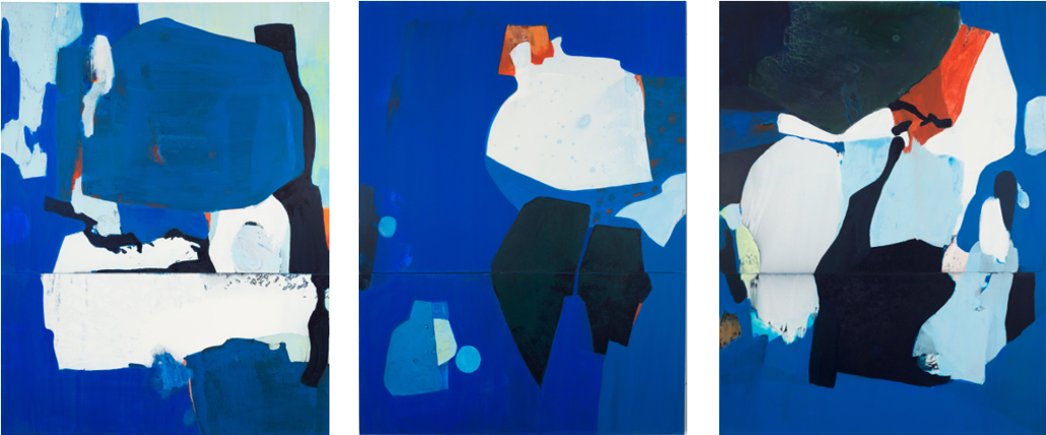
The colours in general are unique mixtures. They are colours without names. It would be easy to say this is a picture in red, this is one in blue: But, what does that mean? How should it be named?
The paintings have titles or remain untitled. Most titles refer to musical inventories, display methods of composition and classification, variation and interlude, calling to mind one of Satie’s musical directions: “Open your head”.
Distance is invoked, ‘Schwedische Variationen’ (Swedish Variations), a concrete place. A place is likewise named in ‘In Daugavpils’, where the paintings can (now) be seen.
The hue of the lower left corner forms a small square in which, on which, clearly contoured, uneven green surfaces reveal the core of the compositional principle of the following series. For the viewer, this “helped to recognise the life of surfaces and their relationship to the atmosphere” (Rilke on Rodin, referring to the artist, not the viewer).
A different hue in the lower left corner, which also helps to ground this small square (21), finds itself on the bottom left as well as on the top right edge of a primarily blue square (22) four times its size directly beside it. And then, can you see the fine traces, almost in the middle of the small square? Blue-yellow-green, unprimed (24) before a second one, equally small or large, appears with the same colours (23)? The surfaces form a different relationship here, without a trace of the hue from ‘In Daugavpils’. Nothing is disconnected. Thus, in the best case, an atmosphere is created.
Fifteen paintings are called Variation. There is a tacit assumption about what a variation is, the altered repetition of something. But, the word ‘variatio’ originally emphasised difference. This can of course only become visible when the same thing also exists. Only in the realm of music, a strict theory of variation dominates. That which stays the same is named: a theme, and that which changes: rhythm, melody, harmony, dynamic. The changed elements enrich the connection by belying simple repetition.
Common to both musical and painterly variations alike is the need for clearly outlined parts that build a whole. Painterly multiplication produces a certain similarity within the paintings. Their meaning can be strengthened through ostentatious curating so that repetition, alongside form and colour, becomes visible as an artistic strategy. Three times three squares equals a tenth square; the whole is more that the sum of its parts. The sight of it, the image, defies calculation; the relationship of the individual parts is obvious. There are several relationships, but this painting (3) has no title.
At first glance the absence of the figurative creates a strong, offensive self-referentiality. It would be a mistake to assume that where no-thing is painted, nothing is shown. For the viewer, similarities result from the serial character of abstraction. Abstraction as process forms the requirements of viewing, hinting at such similarities.
Abstraction is a transformation, not a forgetting; an observation that picks up on Rilke’s notion that any picture is preceded by a material stimulation. In the transformation of the material into the painting he sees a disclosure of personality. Such a perspective on the paintings would likewise be a glance into the artist’s studio.
It shows what has emerged from Erdmute Blach’s continued work on the concept of process: a specific view of the world. The world is unavoidably there. Even outside painting the world consists of colours, surfaces, forms. Abstraction is only one way of dealing with it. What does the world consist of?
The world is changeable. To the left of this large, almost tricolour painting consisting of three canvases (34), you can see two smaller almost monochrome squares (32, 33). Are the two little ones (or one of them) preparing the viewer for looking at that bigger one? Or are the dimensions of that large painting simply enough to ensure that the two smaller ones are only seen after the three parts as a whole, or as an entirety?
The entirety of the large painting is held together by a half-secret frame, left and right; secret, because it can only be seen at the end, on the right, if you recall what was there in the beginning – which colour: the same one.
The parts are also held together by the strong contrast created through moments of merging on and between the canvases. The first and second canvas collide, even if it could be suspected that the slowly brightening grey-green continues under the two reds it encounters. The two reds that meet on the second canvas are not the same; they isolate themselves from each other. Whereas, on the other side, on the other edge, the red tone continues across the canvas before changing into a greenish-grey, recalling that greenish-grey from two canvases ago. Remembering is a thickly applied yet calm trace that endures and becomes a darker tone, one which barely had space at the beginning, but was there. Two distinct boundaries, spaces without canvas, yet coloured (at least on viewing), connect the whole by means of their opposing states. The two distinct boundaries assemble difference.
I won’t point out the expressive bright ochre that directs attention towards brushstrokes, that emphasises painting, emphasises movement, depicts repetition, repeated application of colour, repeated emotion (expressive). The bright ochre, which forms a prelude, presents itself. I will however point out every trace of dark almost-grey, non-black, which primes the fading out of ochre, becoming transparent. The point of culmination is already laid out within those traces. That extremely dark-grey green was before the ochre, is under the ochre. This relativizes the frame; the frame could also be a ground.
Between prelude and finale, orange turns into red. There is not one place where they merge into a third colour. At the (tiny) crossover points, on the edges of colours, some marks call to mind ochre, a reminiscence.
Through interaction, the entirety gains its common ground. What results from the effects of grounding and boundaries is that, as soon as the painting has been (provisionally) read, it becomes clear that contradictions are not resolved but rather intertwined. One colour emerges from the others with an inexplicable self-evidence, as if the first colour, the ground, had only this purpose.
Out of the flow of colour (of contemplation) emerges a place: the image that makes the flow visible. Demonstrations of repeated shifts understood as the halting of change through limitations correspond to the attraction that lies within the principle of variation. Changes create connections – the whole repeats itself in a complex way.
None of the colours have names. They are, generally, unique mixtures, just as the similarity between nameless forms cannot be named, although it can be seen (and shown).
Can you see now, how the two smaller paintings are connected through that missing piece? The large painting is called ‘Mudança (Transformation)’, and as such, what is depicted is named. The transformation is that which lies between the two small squares, between the rusty dark red and the pale water-green. There is nothing that fails to connect. The composition of the three large canvases influences the hanging of the two small canvases. The correspondence between contrasting elements seduces and appropriates the method of viewing. There is similarity.
It results from a way of dealing with the world, from the type of abstraction. There is no one painting, and no one way of viewing either. You could say something about the quality of the colours.
“Seeing what is common. Suppose I show someone various multi-coloured pictures, and say: ‘The colour you see in all these is called ‘yellow ochre’ ‘ . — This is a definition, and the other will get to understand it by looking for and seeing what is common to the pictures. Then he can look at, can point to, the common thing.” Considering the philosophical problem of articulating obvious similarities, Wittgenstein focuses on a conversation that leads from the concrete to the abstract.
The abstraction of the painter relies on light that is reflected from different surfaces. It is no great exertion to ask about the intuition the artist might have had, the mood she might have drawn from, the insight which might have led her.
Rather, tracing the movement in the painting, the dynamic released through it, acquires a momentum of its own and becomes an inspiration to the viewer. That means first and foremost recognising colour as colour. The form of colour, its texture on the canvas, has become the subject of the image.
The accumulation of constellations creates a kind of trace: a recognisable, and thus not necessarily nameable, connection.
The avoidance of figuration is not a refusal to be understood. Repetition produces concentration, permits a viewpoint, the obvious begins to be self-evident. What is to be seen here becomes clear. The colours.
Enabling conversation is one of their qualities. Viewing answers the paintings. Irrespective of when viewing begins, the exploration takes place. There is no monochrome painting, no figurative. None of the colours have names. As soon as the viewer names them, she replys to the paintings. Every name responds to the light just as each painting responds to darkness. Every painting and every image is an objection to darkness. As the poet says: “Of the several answers to darkness, better than sleep …”.
Holger Helbig, 2019